Marketplace returns
Redesigning the returns experience for a marketplace
Problem
22,000 returns-related tickets. Returns hadn't been touched in 5 years
The first meeting happened on July 24th, 2024, me and the Product Manager, almost a year before the first release. Our Kardan team of 9 had just started working on one of the biggest parts of Ovoko.
Returns was originally built 5 years ago. Since then, Ovoko went from 16k orders per month to 41k per week. The number of returns grew, shipping logic became more complex, and unsolved customer support tickets reached around 22,000, just about returns alone.
At the time, I was in my 2-month probation period, working as lead product designer from both a business and design perspective.
monthly orders growth over 5 years
Internal Looker datareturns-related support tickets
ZendeskScaling from 16k to 164k monthly orders overwhelmed the legacy returns system, creating a massive returns-related 22k ticket overhead.
A bad return experience costs you 20% of your customers
This wasn’t just a support operations problem, it was a retention risk. Baymard Institute found that 7% of users would never purchase again from a site solely because of a poor returns experience, and another 13% said they’d be unlikely to return.
Our own users confirmed it:
Research
Called B2B customers directly during my probation period
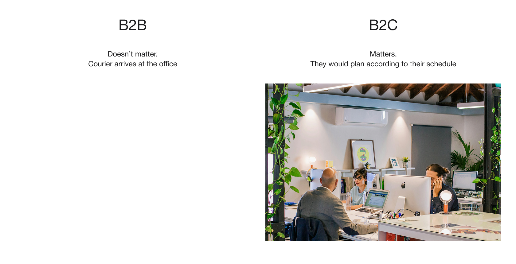
Returns aren’t just a B2C problem. B2B clients, bodyshops, garages, parts resellers, are a big and growing segment of Ovoko’s marketplace. Knowing that, I grabbed an Excel sheet from Daniel, who had just joined as Ovoko’s first B2B salesperson, and started calling those customers myself.
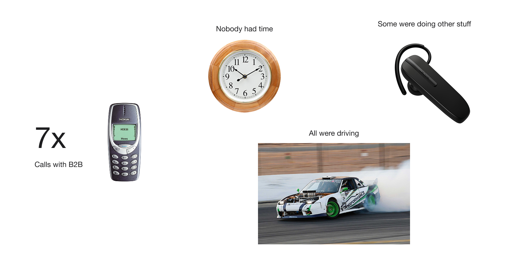
From “I don’t have time” to 30-minute interviews
Before each call, I reviewed their order and return history so I could dive deep and connect questions to their actual experiences. Not everyone had time, some were driving, others weren’t in the best mood, but most were willing to share the pain points they faced with our return flow. About half were business owners, the other half managers.
In the end, I had 7 warm B2B contacts, dozens of insights, and a much clearer picture of where we needed to go.
For B2C, we spoke with French users who had made a purchase on Ovoko in the past 6 months, through Hotjar-recruited interviews. The two groups started showing very different patterns almost immediately.

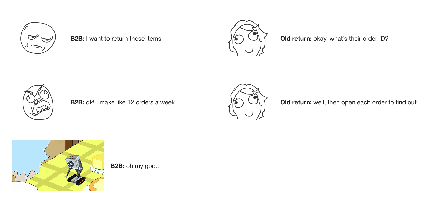
Nobody remembers their order ID — but we were asking for it
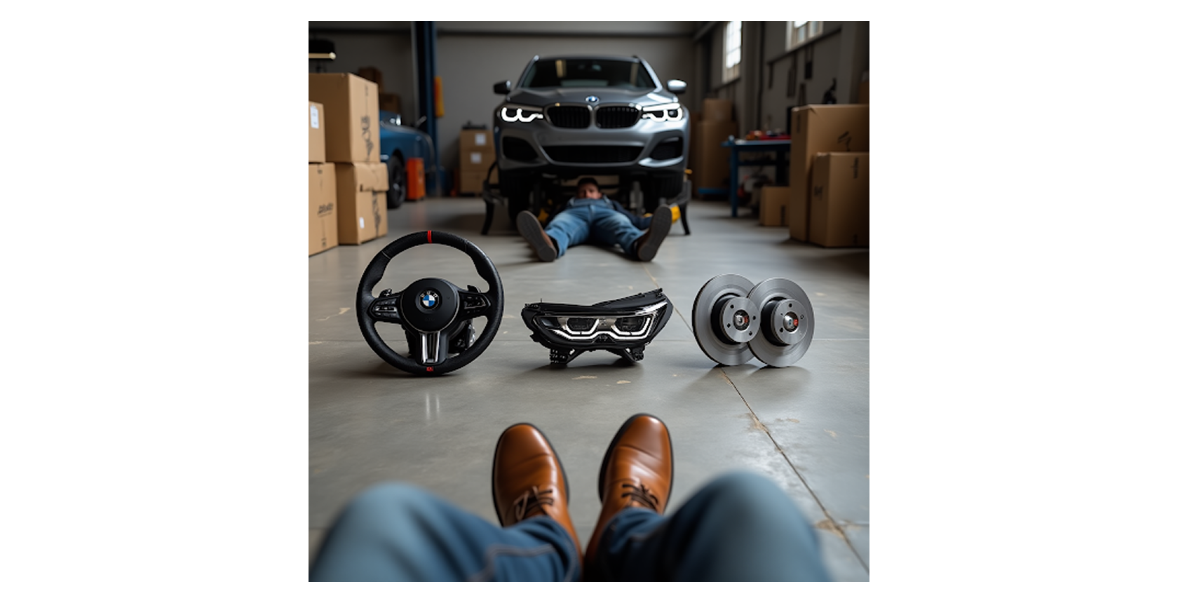
To stress-test our assumptions, we ran an exercise with colleagues. The setup:
Imagine you’re a body shop manager who ordered 3 items: a steering wheel, headlights, and brake discs. Today is Thursday, the items arrived last Friday. Your mechanic tried to install them, but noticed scratches and fit issues. You decide to return all three.
What do you know about your items right now?
"Part name, make, price!" ... "Maybe the date when I ordered?" ... "Part name, make!"
Then we asked: do you remember the order ID?
No. Nobody did. But our old return flow required it as the first step.
Key insights
Two user groups, two completely different return experiences
As the research came together, a clear pattern emerged: B2B and B2C buyers had fundamentally different return behaviors across almost every dimension. These differences shaped every design decision that followed.
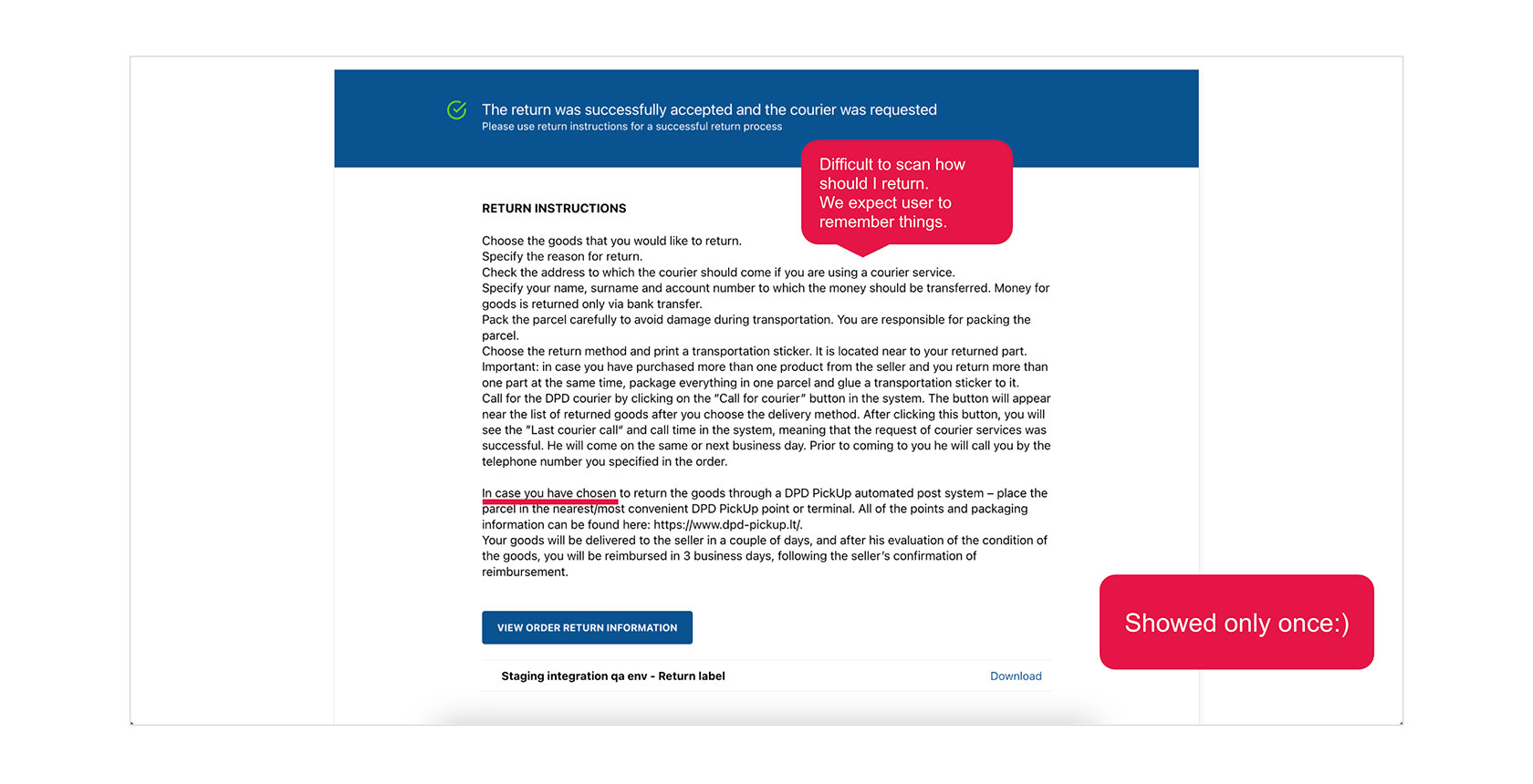
Return instructions were shown once, then disappeared forever
The funniest discovery in the entire project. In the legacy flow, a user would fill out the return form, reach a success page with all the instructions they needed to complete their return (where to drop off, what label to print, how to pack), and then if they closed that window, gone. No way to access those instructions again. Not in their account, not via email, nowhere.
Don’t ask me why.
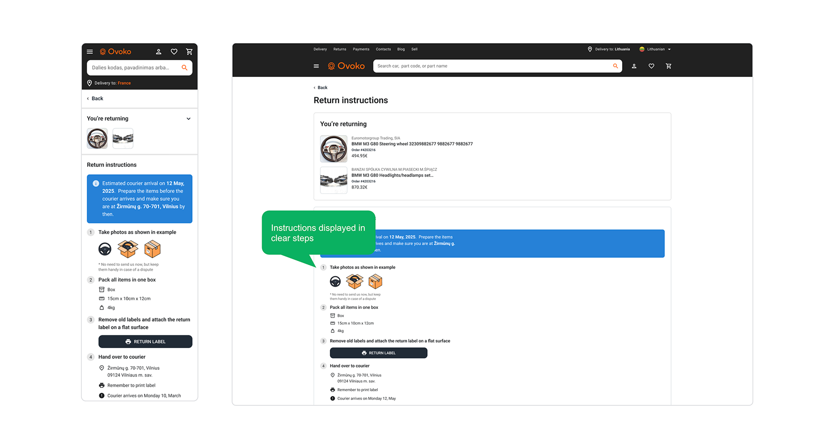
48 different instruction combinations
Making return instructions simple sounds easy until you realise that depending on the carrier, country, package size, and shipping option, there were 48 different combinations of what to tell the user. Each needed to be clear, accurate, and accessible at any point in the return journey.
Design decisions
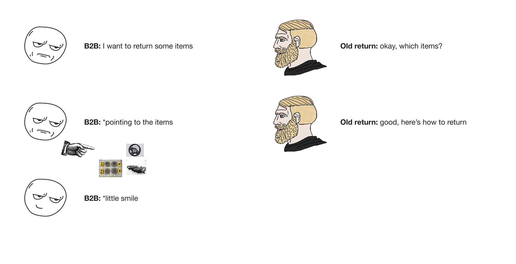
Match the real world — don't ask what we already know
When someone reaches the point of wanting to return something, they’re already unhappy. They’ve spent time researching, comparing, and filling in all their details to buy the item. In the old flow, we added more frustration by asking for information we already had.
From our research, we knew that users typically remember the item name, price, and roughly when they ordered. So we designed a return flow that matches natural behavior — start with what you know, and we’ll fill in the rest.
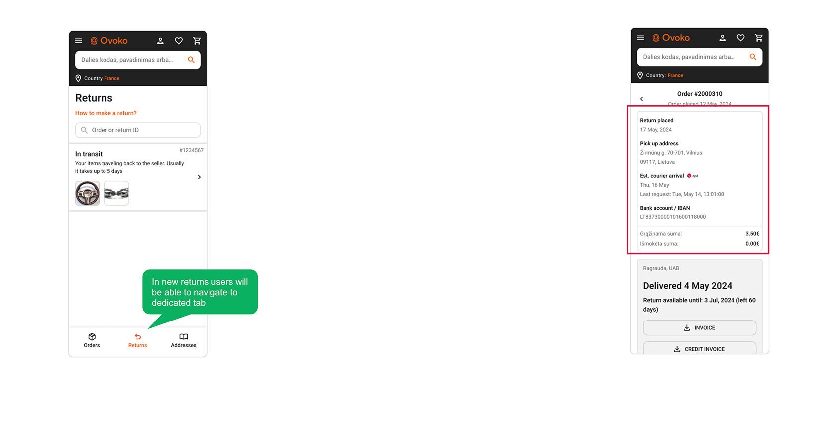
A dedicated returns section, because returns aren't a sub-feature of orders
Both orders and returns are complex in their logic. Multiple sellers, different shipping options, parts ranging from tiny clips to pallet-sized bumpers. When sellers receive a returned item, each has to review it in our SaaS. Given this complexity, a separate "Returns" section in the buyer’s account made a lot of sense.
No more endless scrolling through the legacy order list trying to remember which order contained the item you returned.
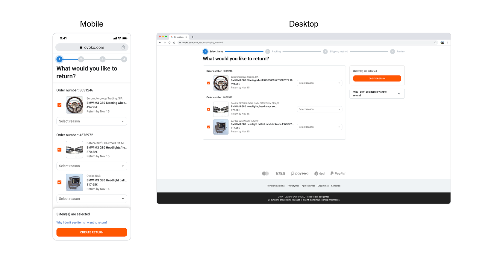
Select items by what you know — not by order ID
From our research, we learned that in the moment of urgency, users know two things: what they ordered and what they want to return. The new first step reflects that, a list of ordered items across multiple orders, where users simply select what they want to return.
The UI mirrors the real world: you’re standing in front of the items, you know what they are, and you pick the ones going back.
Scheduling around real life — courier pickup that respects your calendar
A key difference between our two user groups was parcel handover. B2B users work from bodyshops and manage returns during business hours. B2C users receive items at home and need to arrange courier pickup around their personal schedule, and they’re often not home during the day.
We added an optional selection for preferred courier arrival days, giving B2C users the control they needed without adding friction for B2B users who didn’t need it.
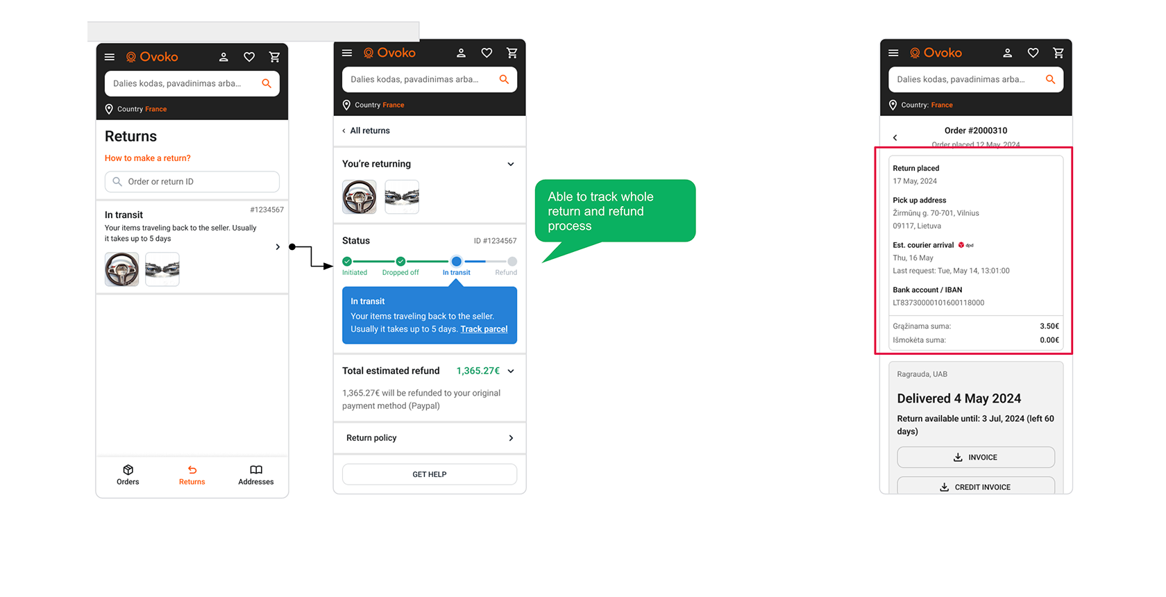
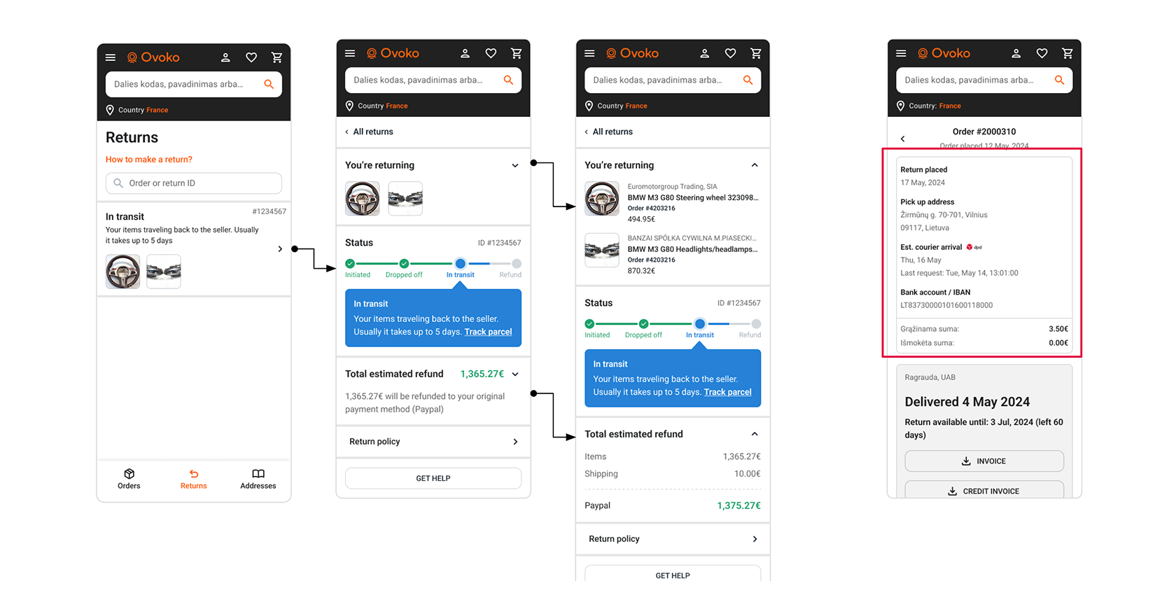
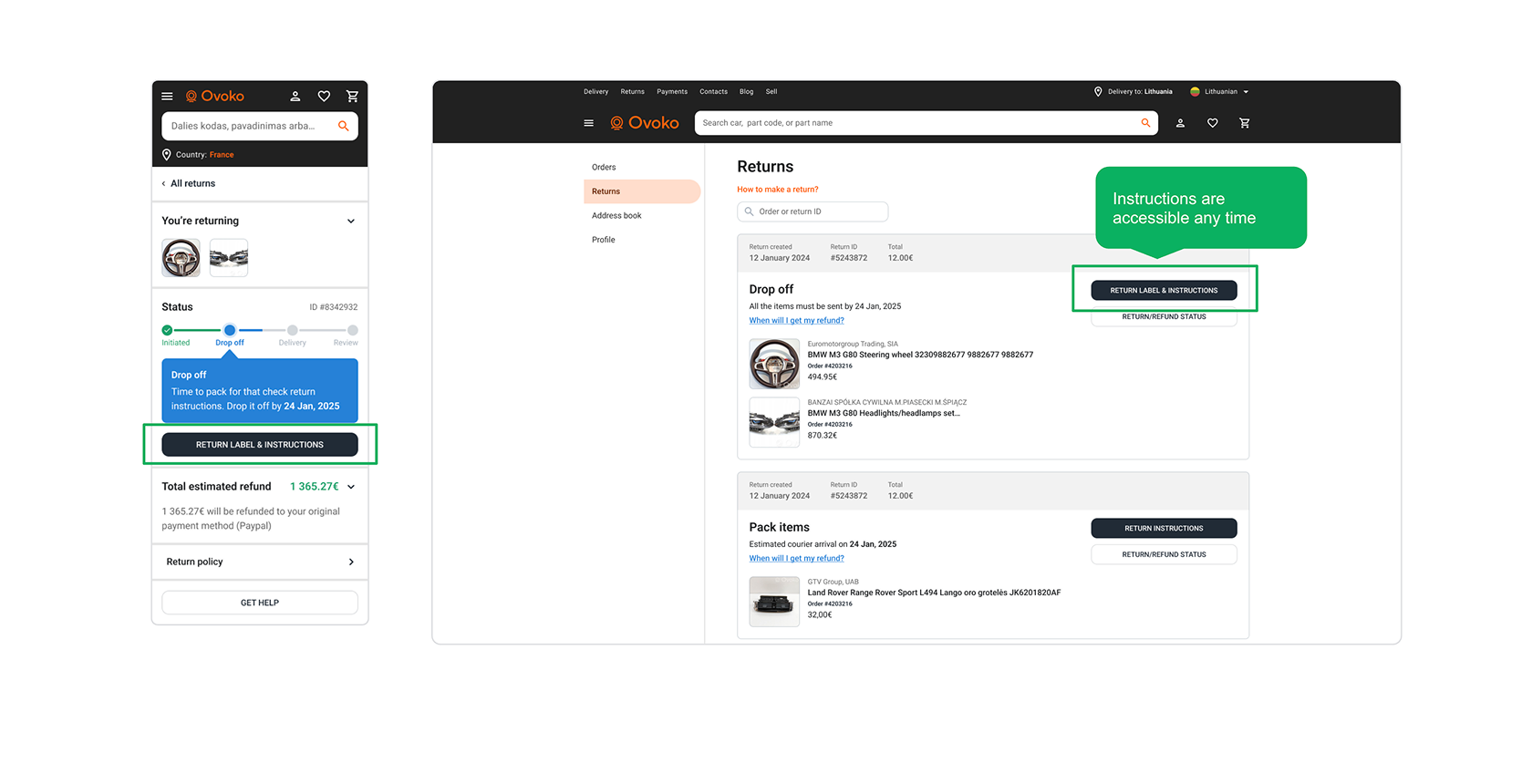
See your return journey at any time
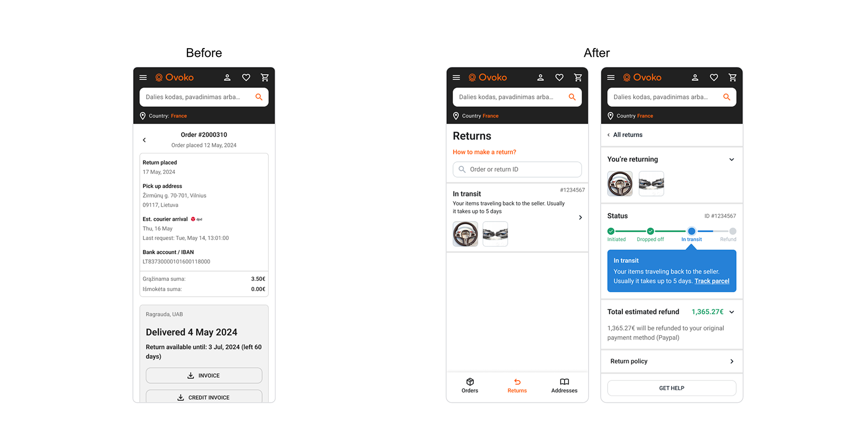
In the old system, finding your return status meant remembering which order it came from and digging through a long list. We introduced a dedicated returns tab where every return and its items are visible at a glance, with a clear status timeline showing exactly where each item is in the process.
We followed one rule throughout: simple and clean on the surface, but more details available if you want them. Progressive disclosure kept the interface approachable while giving power users the depth they needed.
Instructions you can actually find — all 48 combinations of them
Remember those instructions that disappeared when you closed the window? Now they’re accessible anytime, in the UI and via email. Whether you need them 5 minutes after submitting or 5 days later, they’re always there.
The harder challenge was making 48 different instruction combinations feel simple. Depending on carrier, country, package type, and shipping option, the steps a user needs to follow are completely different. We built a system that serves the right instructions for each case while keeping the presentation consistent and clear.
Before and after